QUICK & EASY covers/posters/etc. WITHOUT GenAI
AI posters look like what Christian rock sounds like.
Overly compelling yet creatively bankrupt. All the eye catching colors and fonts without any of the charm that actually captivates. Posters that look the exact same; glossy album covers where artists decide the thing to cut corners on is more art; and creative decisions that ultimately alienate their audience.
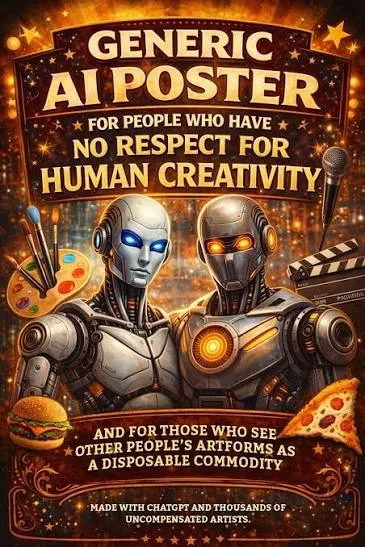
Some of the arguments you may have heard for AI art might be:
- "We don't have time to learn how to draw/paint/graphic design/etc, so we're gonna use AI"
- "It's just for the poster, for promotion! You have to come to the actual event to see the artists!"
- "It looks passable, so what's the harm?"
Well... aside from the environmental damages along with the plagiarism of actual artists, it's lazy. Why would I want to go to your event when you can't even set enough time aside to make a compelling poster? Why would I listen to your CD when you couldn't even put in the effort to make a proper cover? Use of AI isn't just lazy; it's rude and insulting to the people whose attention you want.
But how do you make a compelling piece without AI when you're strapped on time and skill?
First off: I think I speak for most when I say we prefer you make something crappy-looking yourself than turn to AI. This is one of the best promotional posts I've seen following this trend:
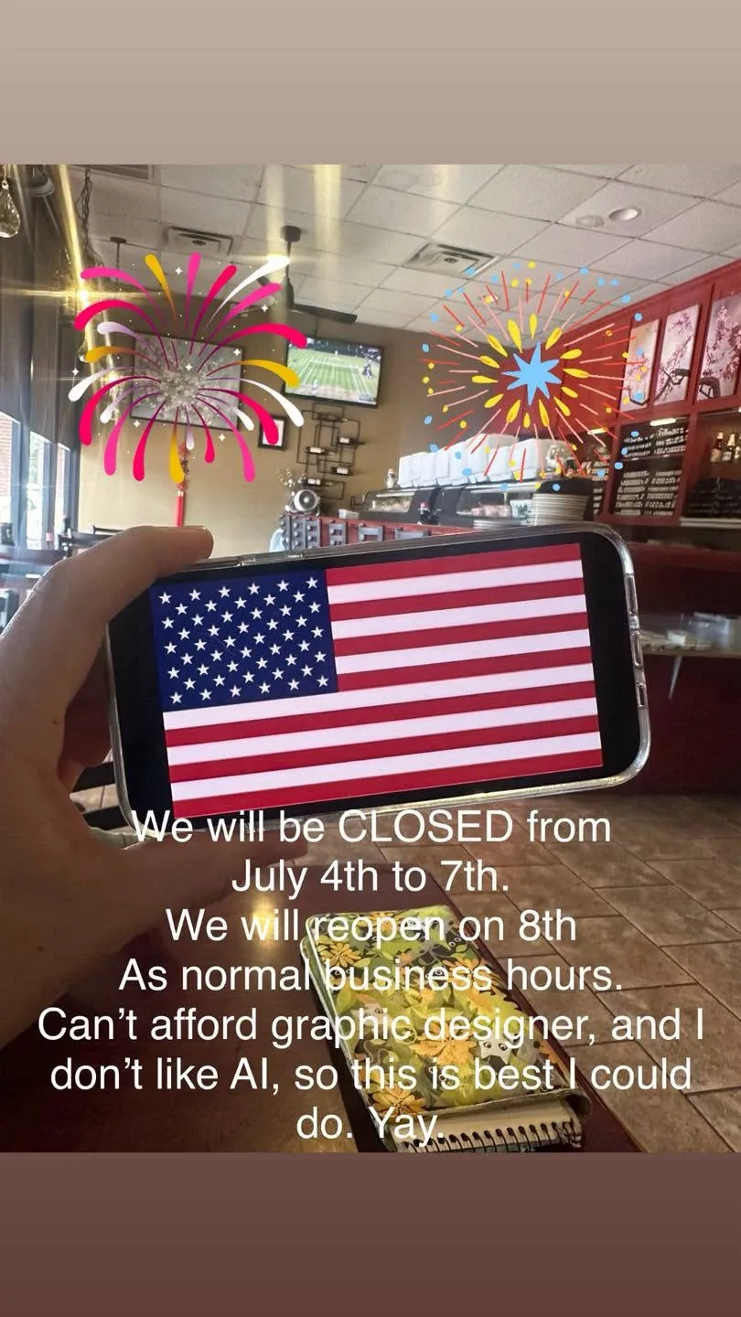
It's not what I'd study in graphic design school, sure, but it's miles better than any AI slop ever "created". But if you really want something that looks good without AI, without paying any artist a penny, here's a quick tutorial you can use for anything. All you need are royalty free graphics, the free version of Canva, and this image blending website I found in 2 minutes of searching.
"This just looks lazy"
Wrong. AI "art" is lazy. Bad graphic design is something worthy of reverence and endless praise: it is stupid (complimentary).
Let's make a poster easy peasy lemon squeezy
You can do this in two to four layers, dubbed the following:
- Background
- Texture
- (optional) Subject photo
- (optional) Text
For a subject, let's do uhhh, a Spring-themed craft fair. I miss Spring in the midst of these goddamn heat waves.
Planning
What comes to mind when you think of Spring?
Small flowers growing on trees? Easter bunnies? Sunshine? Groundhog day? Butterflies? Spring cleaning? Gardening? Wind chimes? A hellish academic year coming to an end? Any of those or something else? Pick one or two and let's go. Ultimately planning is in large based on instinct. You know your event, your art, your craft best.
Background
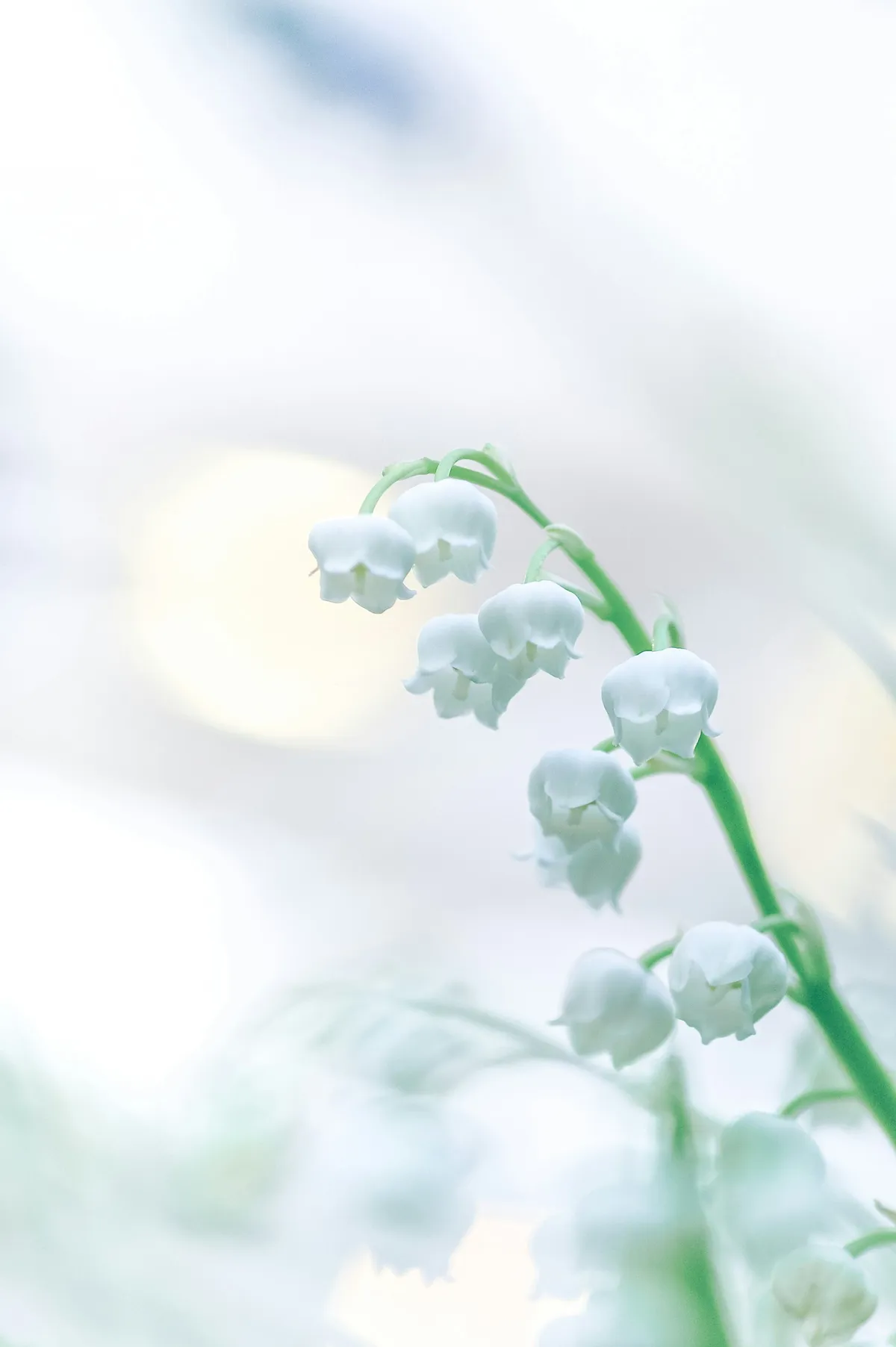
I like flowers so let's do that. Let's use lilies for no ulterior motive whatsoever.
Now, when you find your images, you want to find something that is royalty free. I'm no lawyer, but basically this means you can use it for promotional and/or commercial uses (AKA event promotion and/or album covers). You just can't sell the image without changing anything. This is also called plagiarism, something ChatGPT is quite adept at, and if you play your cards wrong you can end up with a nasty lawsuit on your hands.
There are many websites you can use, but I like Unsplash the best. I'm just going to look up 'lilies' and hey look at that; a ton of images I can use for free! And I only had to type one word for it!
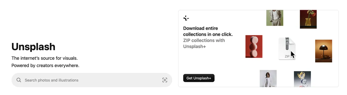

(note: the ones with a "+" by it are premium.)
I like this one, so I'm gonna use it.
Texture
This doesn't literally mean texture like a paper texture or how fabric feels. You can simply use a different photo as a means to make the first one more compelling. Typically I find using a pattern of some sort or a scanned texture works best.
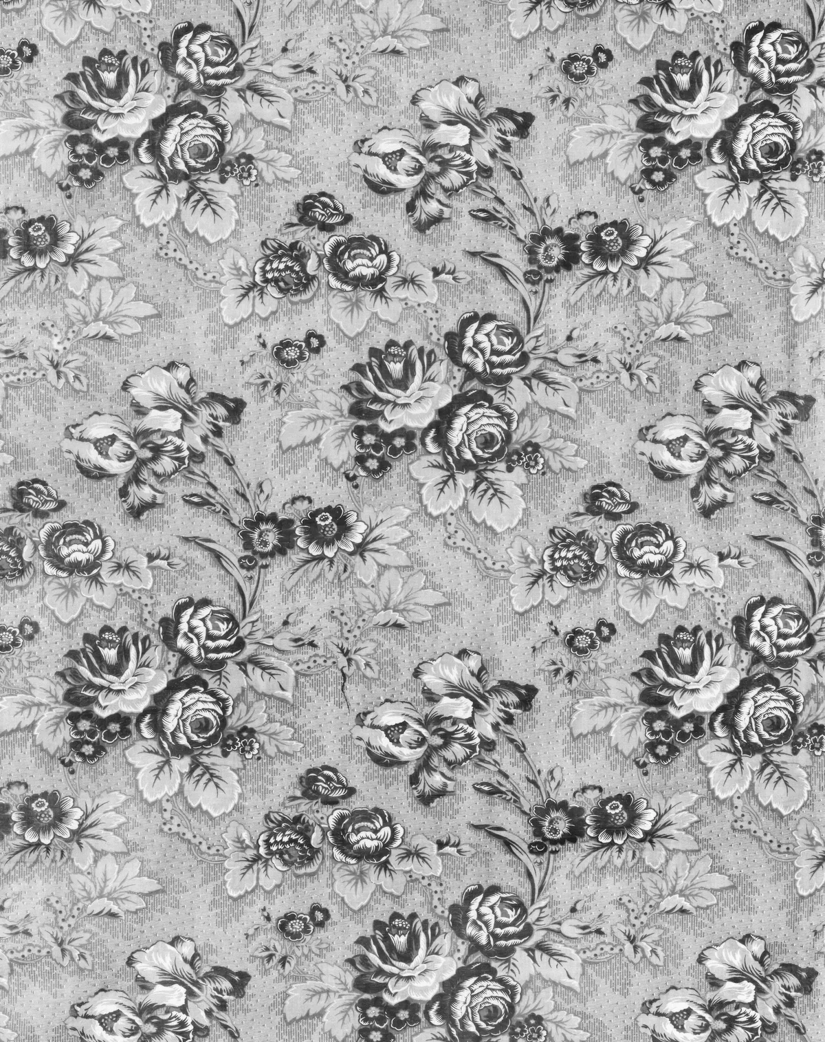
I'm gonna try one that's a black and white flower pattern. With the Multiple option, this is what I got:
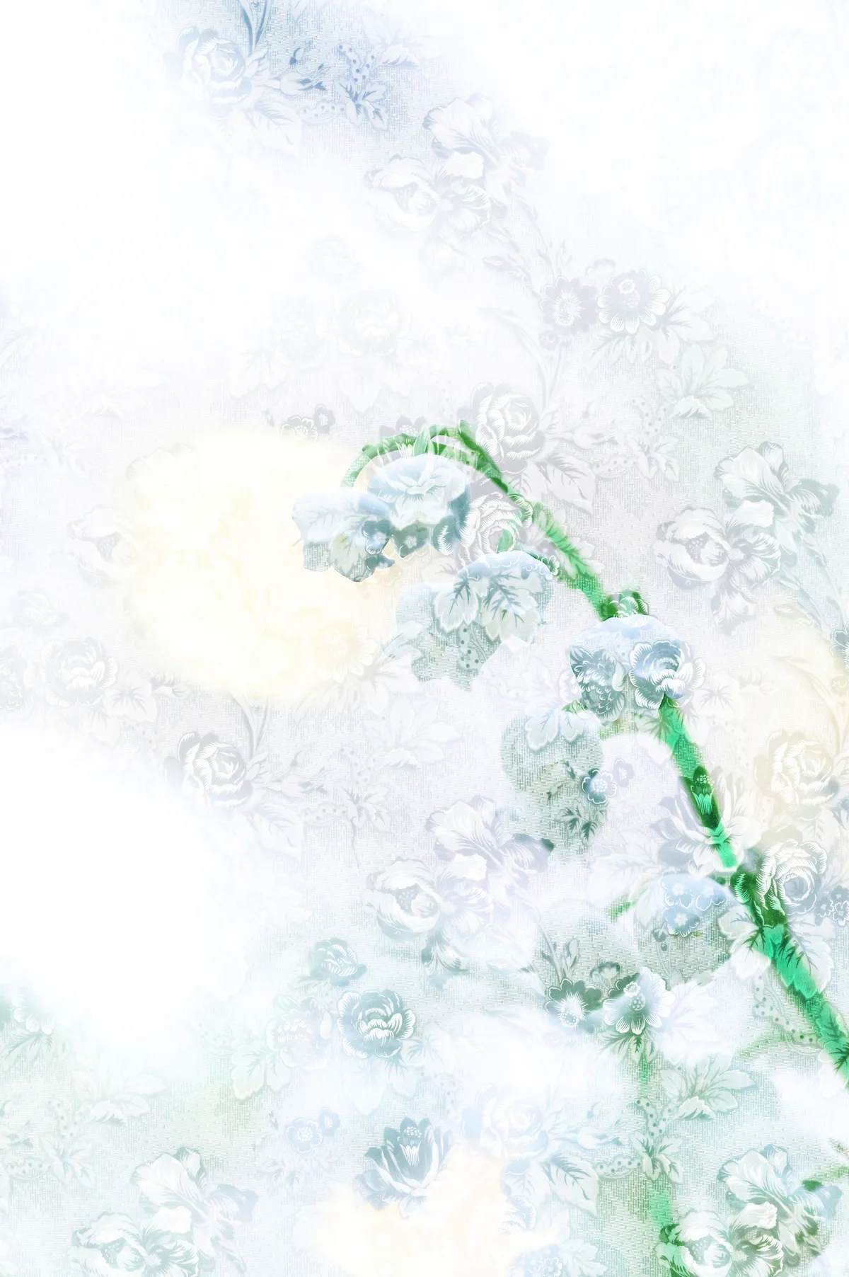
Now, download your blended image once you like it, and upload it into Canva.
Blending Modes
You don't need to know what any of the specific blending modes mean; you can look it up if you're interested. All you need to know is that you can look through the blending modes until you find one you like for your poster. 'Multiply', 'Soft Light', or 'Overlay' are easy and my favorites.
Subject Photo
You can also add a subject on top of (or in between) your blended images. This might make it more compelling, or it might make it too crowded to read. Ultimately, do whatever you want.
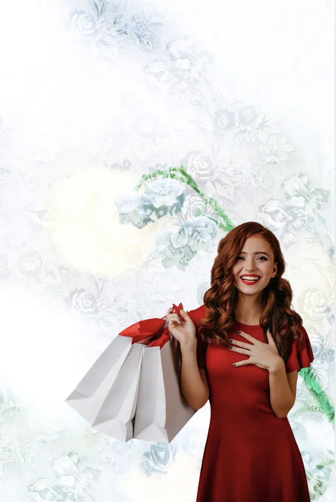
Since we're doing a market flyer, I found this photo of a girl smiling:
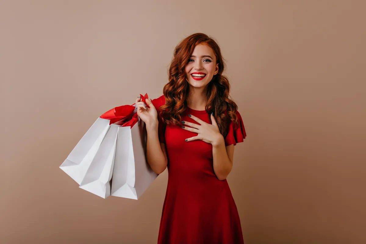
Typically, removing backgrounds is a premium feature on Canva and elsewhere, but you can use this background removing tool on delphitools.
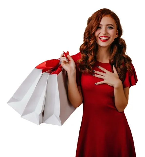
Here's what it looks like. I forgot to document this, but I decided to change the image of the woman to grayscale. It looks fine without the grayscale, if a bit too much of a contrast.
Text
The most important part of text is probably if you can read it. Typically, this is why you won't see yellow text on a white background. If you're struggling to read it, chances are people won't bother to look. You can look up text accessibility tips and find some options. If you're experiencing AI withdrawals by now, you can even ask your old friend ChatGPT.
I put in some basic text and this is what I got:
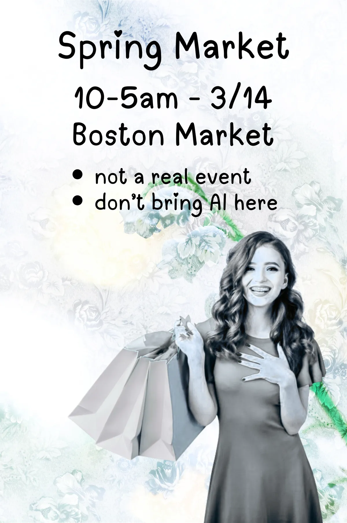
Voila. A poster for your event without AI.
(Yes there's a typo, it can easily be fixed. Please forgive me; at least it doesn't use AI.)
"I can't do any of that!"
Please just try. I'm not asking you to make the Mona Lisa of event posters; I'm simply asking that you give it a try. And if you don't want to, or you try and you hate it more than these goddamn heat waves, hey - I'm just a gooner on the internet. Ultimately this blog post's purpose is twofold: shitting on AI, yes, but encouraging people to be creative. It's so much more worthwhile than typing a generic prompt into ChatGPT.
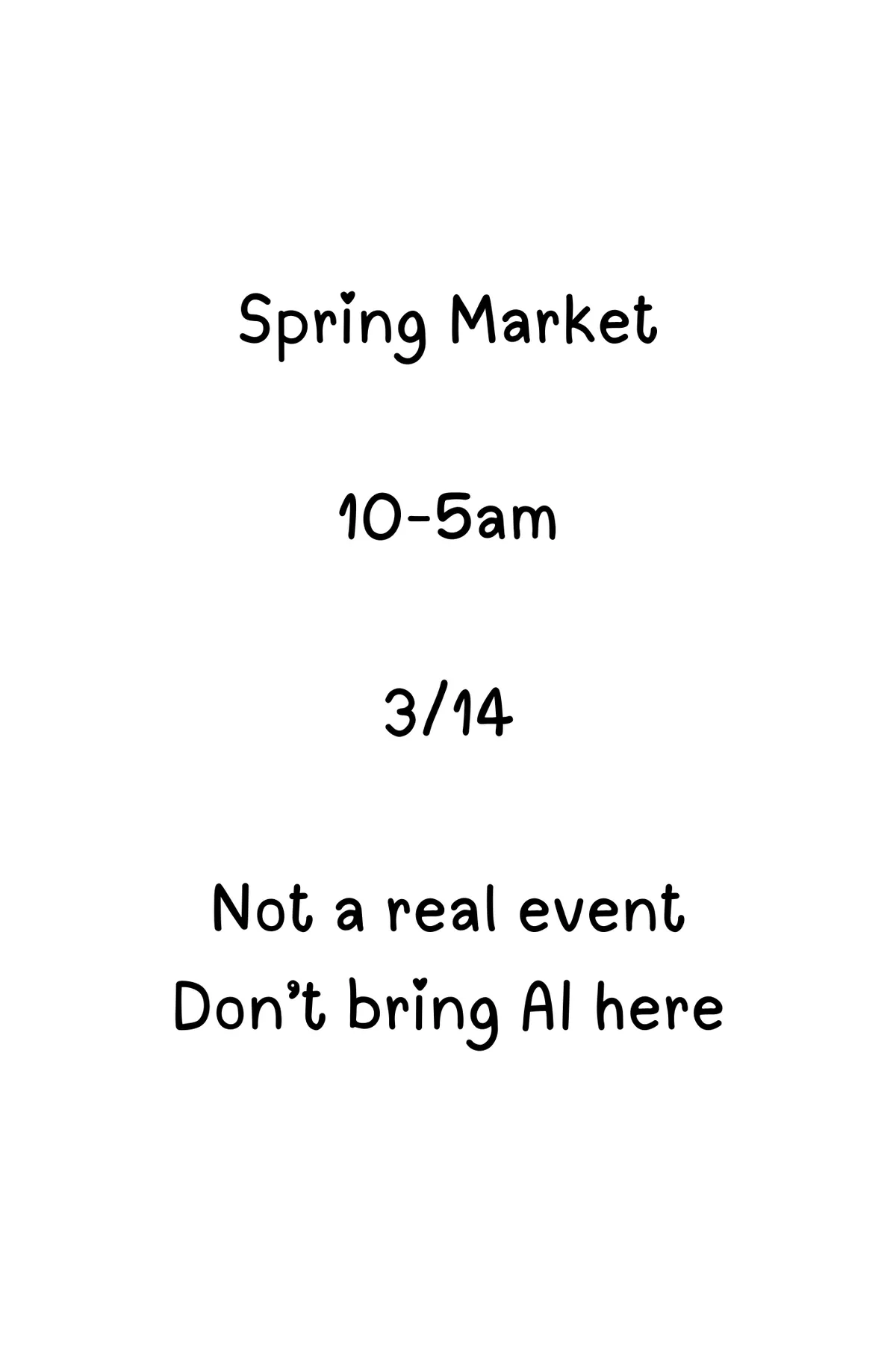
If you really are so allergic to graphic design, though, sure thing; here's another way to make a better poster than you ever could with AI:
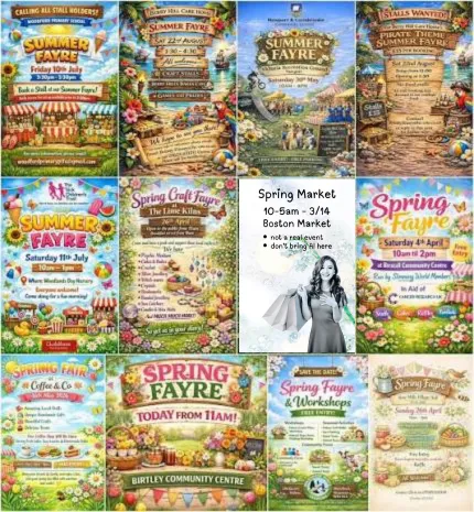
But make your work stand out from this compilation of AI-generated posters for spring markets. Ultimately, the more different it looks, the more heads you'll turn. More eyes mean more sales, more attendance, whatever you want.
And hey, small bonus - you won't be using the environment-destroying plagiarism machine. Just as a fun extra.